We are very pleased with the results of REO’s experimentation programme. Their cohesive approach to data analysis and user testing has resulted in improved metrics for vital business KPIs.
size?
Investment
payment methods
Our contributions
- Experimentation Strategy
- Analytics deep-dive
- UX Research
- AB testing with Monetate
- UX/ UI Design
Tech partners
Challenges
The two core objectives:
- Demonstrate the power of data-driven experimentation, highlighting how it can convert casual browsers into paying customers and positively influence revenue.
- Forge a strong partnership with the internal team to amplify the effectiveness of their existing experimentation.
The REO approach
The collaboration kicked off with an in-depth data analysis to gain insights into user behaviour, traffic sources, and the shopping journey from browsing to buying, pinpointing where users were dropping off.
Following this, user testing sessions in our UX labs provided a closer look at real user interactions, identifying challenges and obstacles to making a purchase. Based on these insights, we crafted a series of test ideas focused on:
- Streamlining the search and product discovery process.
- Enhancing understanding of product offerings.
- Making the purchasing process more user-friendly.
To maximise impact and efficiency, we divided the site into three key areas for simultaneous experimentation:
- Promo Code Visibility.
- Checkout Call to Action (CTA).
- Listing Page Optimisation.
This division allowed us to prioritise and categorise hypotheses according to size’s goals and objectives, using our prioritisation framework that evaluates:
- Potential impact.
- Underpinning research.
- Confidence level.
- Required effort.
Deliverables
Checkout CTA
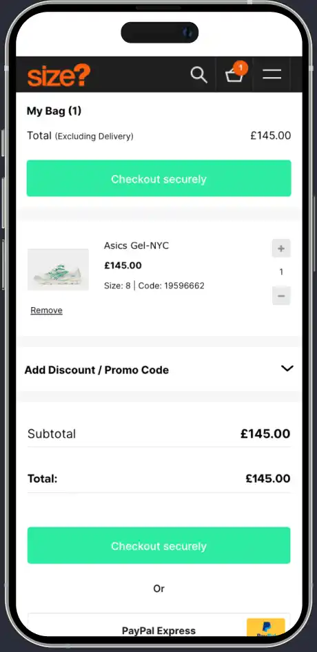
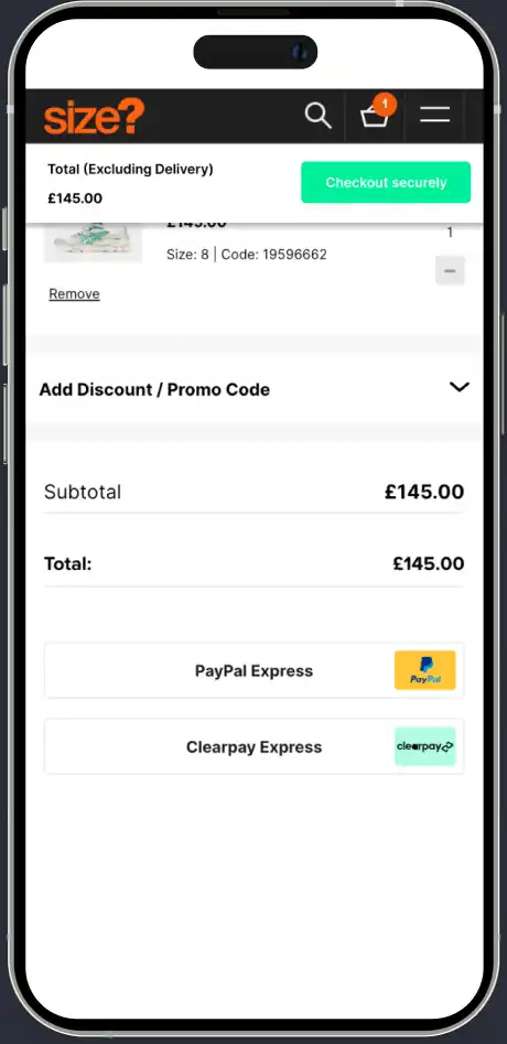
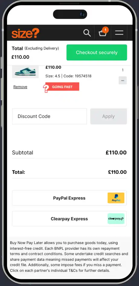
As we continued to analyse the basket page on mobile, we observed that key information, such as pricing and payment methods, were being pushed down the page due to a duplicate checkout button. We wanted to ensure that this information was brought into view, while always keeping the checkout visible for customers.
We tested removing the duplicate button and making the remaining one sticky – so that it remained on the screen as users scrolled down. Not only did this test result in increased transactions, but we also saw a significant uplift in users checking out with alternative payment methods such as PayPal and Apple Pay.
Promo Code Visibility
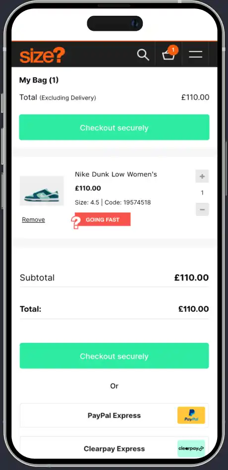
One of our key goals was to reduce the number of shoppers abandoning their baskets before making a purchase. 61% of visitors were dropping off at this stage on mobile, so we conducted user testing to find out why this was happening. We discovered that users were not aware of the promo code which was available on the basket page, as it was hidden and they would have had to click or tap to view it.
Users were expecting to find the promo code just below the payment methods, so when they couldn’t see one they presumed it didn’t exist and they were less inclined to check out.
The outcome
In just a few months, we identified and eliminated several friction points on the size? website that were previously unnoticed, and highlighted the importance of ongoing experimentation to maximise the return from their web traffic. This has been instrumental in enhancing sales for size?



“Utilising a combination of user research and data analysis, we were able to identify the basket and checkout experience as a key area of friction for customers.
“This clear focus enabled efficient collaboration with the internal CRO team at Size? to amplify the effectiveness of their existing program by introducing supporting qual and quant data points.”