Our goal to swiftly elevate British Gas' digital presence quickly became a reality thanks to REO’s data-driven experimental approach. We’ve been blown away by the results and it’s led to a step-change in mindset within the team.”
Will Booth, British Gas
HomeCare quotes
landing page visits
landing page visits
Our contributions
- Experimentation strategy
- Web analytics deep-dive
- Usability testing
- UX/ UI design
- AB testing
Tech partners
Challenges
As a market leader and trusted brand in the energy sector, British Gas wanted to elevate the outdated designs on their existing journeys so their digital offering reflected their expertise.
To create a new benchmark for visual excellence whilst simultaneously improving conversion, British Gas knew they needed radical change rather than small tweaks.
As such, the brand turned to REO for rich insights into digital usability, as well as rapid experimentation to understand customer preferences and elevate the product offering.
REO was tasked with providing assistance to remove blockers customers may face when making purchase decisions, demonstrating best in class CX with improved information architecture.
British Gas had some overarching business objectives for REO to help achieve:
- Kick-start interest in the concept of experimentation to the wider business and encourage a step-change in mindset
- Transform the HomeCare journeys using a customer first approach, engaging customers more visually and encouraging them to take cover packages rather than standalone cover
The REO approach
REO kick-started their CRO strategy by combining comprehensive analytics data with usability testing insights gathered from in-market participants. These valuable findings shed light on purchase friction within key sales funnels onsite.
The research stage revealed that users were finding it difficult to understand and compare products due to the content on the Boiler & Heating
landing page.
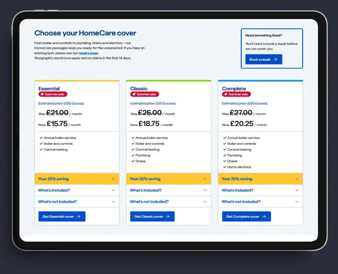
Users also did not realise the pricing was estimated rather than a guideline before a personalised quote was given.
This acted as a purchase deterrent; quantitative data supported this finding as there was a 75% uplift after users saw their quote.
REO used these findings to create tailored hypotheses and design solutions which would inform the experimentation launch.
As part of the approach, REO also evaluated the Home Services page in terms of its effectiveness in directing users to various landing pages within the HomeCare range.
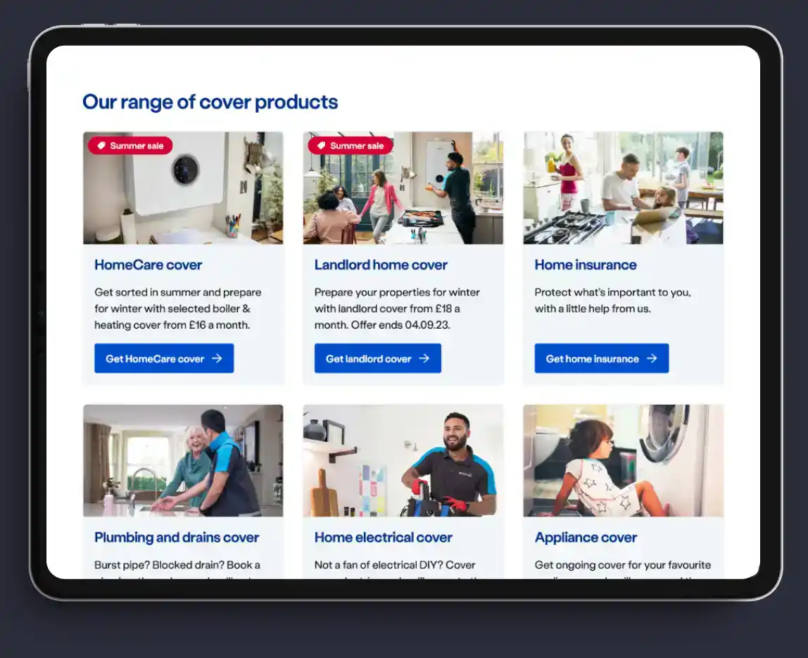
British Gas wanted the range of cover to be displayed on this page in a more engaging, visual way which would reduce information overwhelm.
Once the findings and suggested approach was fed back to various British Gas stakeholders, they quickly signed off on REO managing and delivering the experimentation strategy incorporating design, development and data analysis.
By identifying potential issues early in the process and designing experiments which could be iteratively improved based on results, REO mitigated risk by allowing for alignment with user needs and preferences before rolling out full-scale implementation in a live environment.
Deliverables
New Style Table
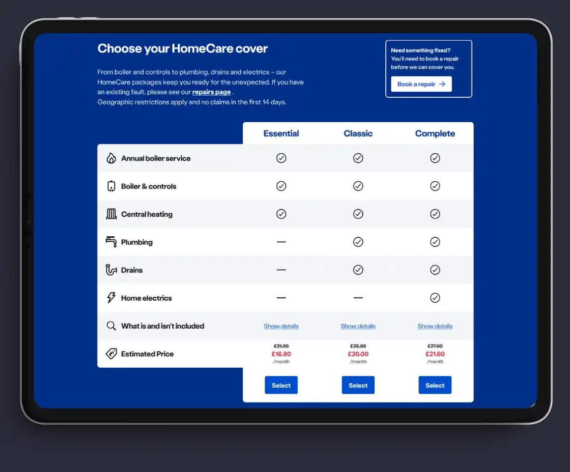
To tackle the large drop off rate on the Boiler & Heating landing page, REO redesigned the cover table, listing out cover feature names and using iconography to aid understanding.
Using ticks and dashes to demonstrate whether the feature was covered in each cover package assisted with a at-a-glance comparison, and the table format helped with a side-by-side tier display on mobile.
This test resulted in a 26.33% uplift in HomeCare quotes.
Landing Page Copy
REO continued work on the Boiler & Heating landing page by evolving product copy, rewriting and redesigning the main body landing page content surrounding the cover table.
The experiment focused on explaining each aspect of the cover in more detail, describing product use cases using visually-driven language and highlighting advantages British Gas has over competitors.
Testing resulted in a 9.86% uplift in quotes for the winning variation.
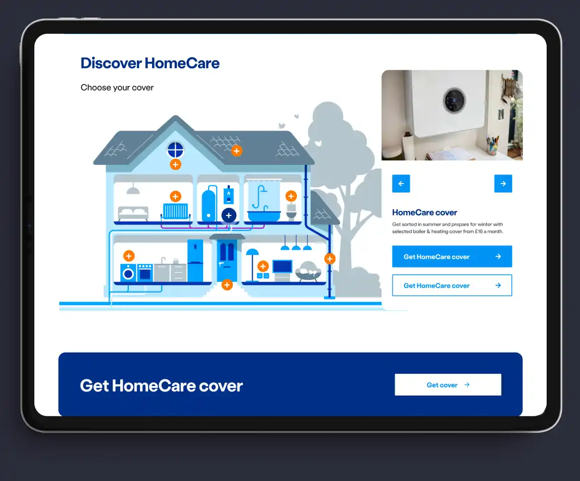
Interactive House Diagram
To reduce the level of text-based information on the HomeCare services hub, REO gained a thorough understanding of the product and brainstormed ideas before deciding to test an interactive house diagram to replace the previous tiled layout.
Using this approach allowed the user to click through options and digest visually engaging information at their own pace.
The driving force behind the experiment was enabling visitors to understand the value of bundled cover with a gamified experience which provided a more cohesive picture of the service offering.
This new design resulted in a 12.5% uplift to the Boiler & Heating landing page, along with a 22.13% uplift to the Boiler Repairs landing page.
The outcome
REO’s CRO strategy, incorporating rapid prototyping underpinned by UX insights and analytics, resulted in customers having a greater understanding of the HomeCare range of services, making them more likely to get a quote.
This equated to a 36% sitewide uplift in HomeCare quotes, with a success rate of 54% across the 11 experiments.
By overhauling pricing tier messaging and product descriptions on the Boiler & Heating landing page, users could understand the product value and compare tiers quickly, making them more likely to convert.
The interactive house diagram unearthed more product information than was originally available on the page, ultimately driving users down the path of exploring bundled cover rather than individual products.
Understanding that customers were noticeably more receptive to layered information and visually-driven content, British Gas rolled out the diagram within just a month.
Inspired by their partnership with REO, British Gas is now trailblazing a visually-led digital experience which avoids information overwhelm and elevates consumer-centricity as a central approach.



“This HomeCare roadmap helped British Gas elevate their CRO programme from the first maturity stage (Basic CRO) to the second stage (Strategic CRO).
Listening to customers via user research and analytics data before formulating test ideas allows to you pinpoint the real problems and then solve them. Being data driven leads to a higher win rate.”