We were really impressed with the team at REO – from the consultants that helped us devise experimentation ideas, to the UI designers that made the changes. The results we achieved were great and I look forward to working with REO to make impactful changes to the Reiss website
Reiss
Our contributions
- User Experience Analysis
- Experimentation
- Design
- CRO
- Strategy
- KPIs & Reporting
- Design
Tech partners
Reiss
Reiss is an iconic British fashion brand recognised around the world. Since its creation in 1971, REISS has established a design philosophy centred on creating modern menswear, womenswear, accessories, and childrenswear that transcends time and trends.
With a London in-house atelier and a design team dedicated to delivering pieces that continuously embody its legacy, REISS today operates as a modern fashion house, offering attainable-luxury collections of unwavering elegance.
Challenges

Reiss is committed to enhancing and streamlining its online user experience, making it a top priority. The comprehensive analysis conducted by REO affirmed Reiss’s existing belief that the user journey on their website was indeed complex and convoluted. This validation from an external source reinforced the need for changes and optimisations to ensure that visitors have a straightforward and enjoyable experience while navigating online. By addressing these issues, Reiss aims to provide its customers with a more user-friendly and seamless journey, ultimately enhancing customer satisfaction and engagement.
The REO approach
REO’s team of Conversion Rate Optimisation (CRO) specialists embarked on a comprehensive journey to enhance Reiss’s online user experience. Their initial step involved an in-depth examination of the user journey, meticulously analysing every aspect. This process allowed them to identify key areas for improvement and optimisation.
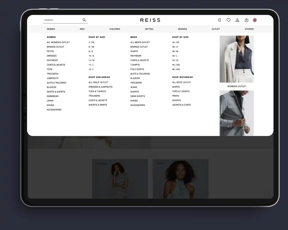
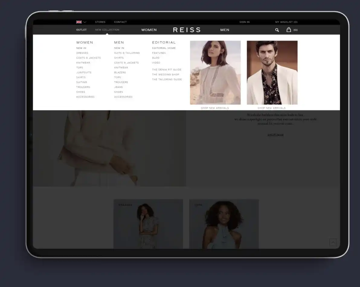
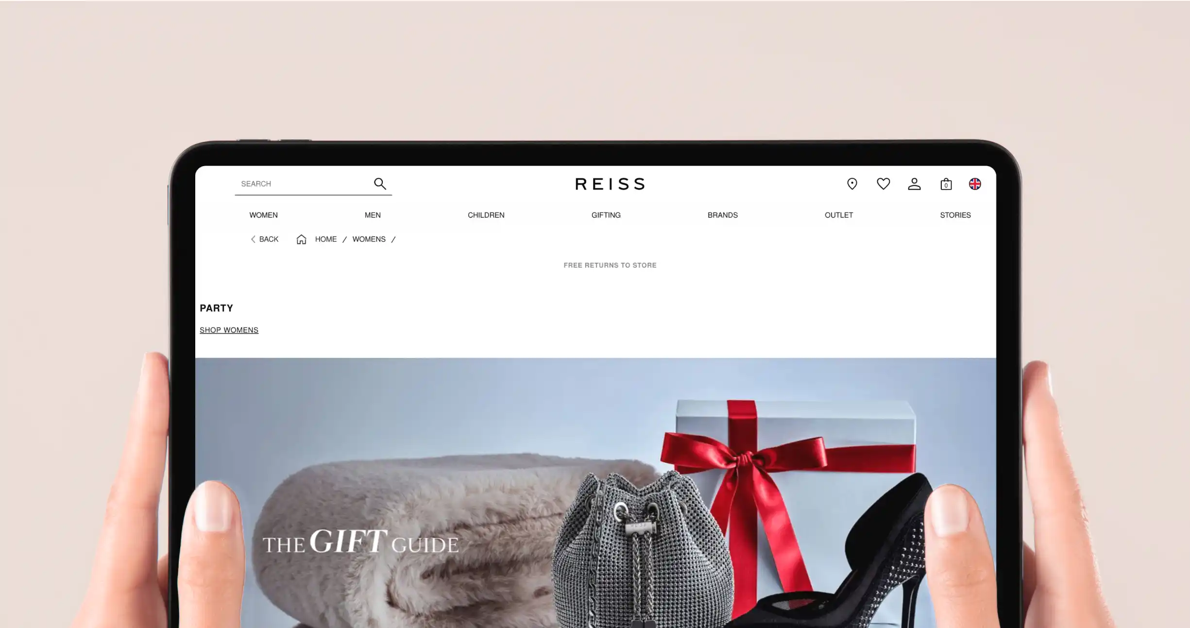
One of the primary areas of focus was the top navigation of the Reiss website. Recognising its pivotal role in guiding users through the platform, the CRO team dedicated special attention to refining it. One notable strategy they employed was the removal of duplicated content, a move designed to simplify the user experience.
By eliminating redundancy in the navigation, the CRO team aimed to achieve several objectives. Firstly, they sought to enhance engagement by presenting users with clear and concise options that reduced confusion. Secondly, the streamlined navigation encouraged users to delve deeper into the Reiss website, exploring a wider range of products and content. This not only improved the overall user experience but also increased the likelihood of users discovering and engaging with Reiss’s offerings.
Deliverables


The outcome


