Sixt has a well-established experimentation and CRO strategy and we have conducted many tests over the years, finding new ways to drive uplift is not easy. Having worked with the team at REO for over 3 years we have always been really impressed with how creative and strategic they are to find new ways to improve the performance of our websites in all countries.
Sixt
Our contributions
- Research Polls
- Experimentation
- Urgency Messaging
- Design and UX Recommendations
- Problem solving
- Research strategy
- Design
- UX/ UI Design
Tech partners
Sixt
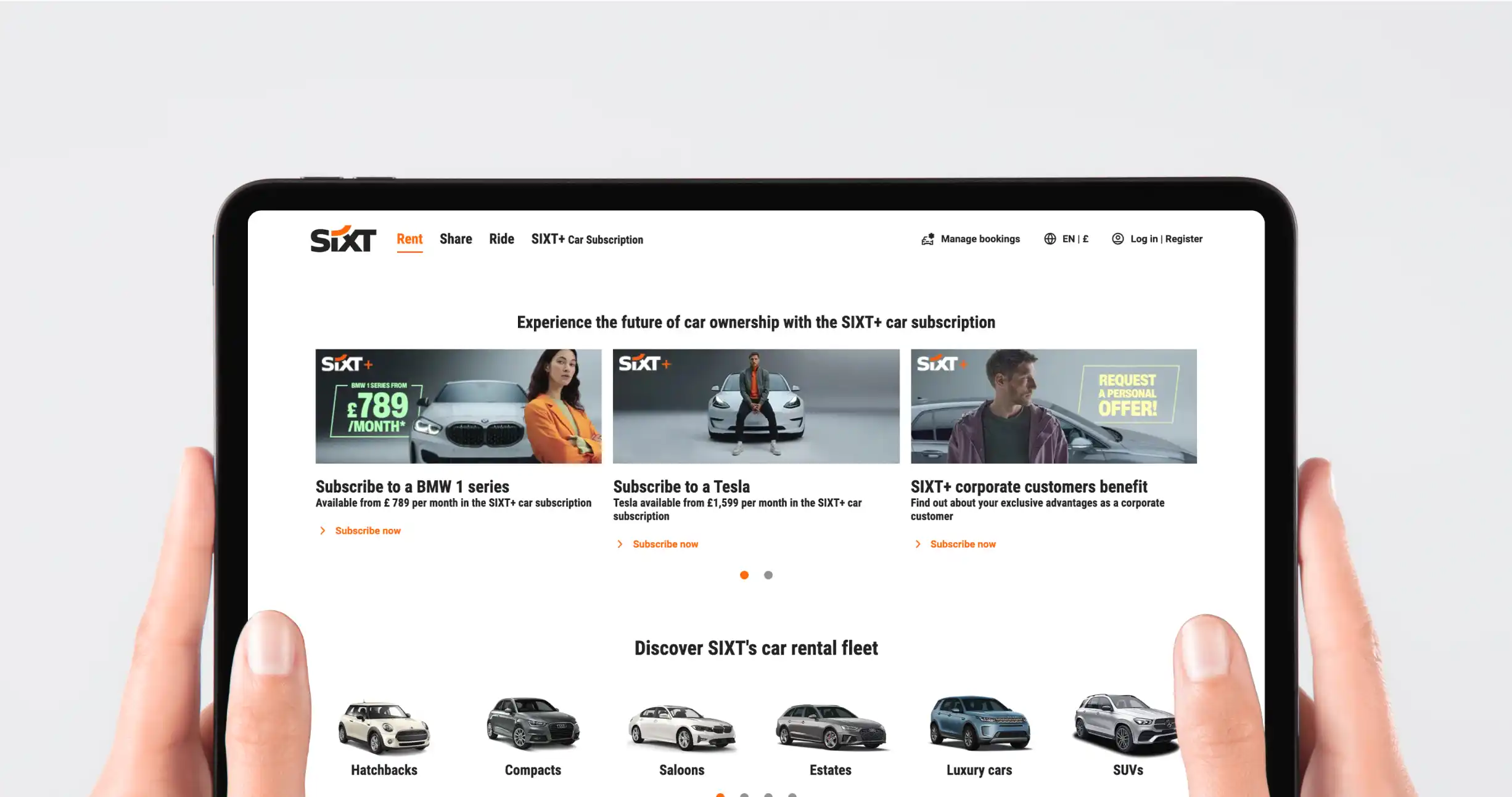
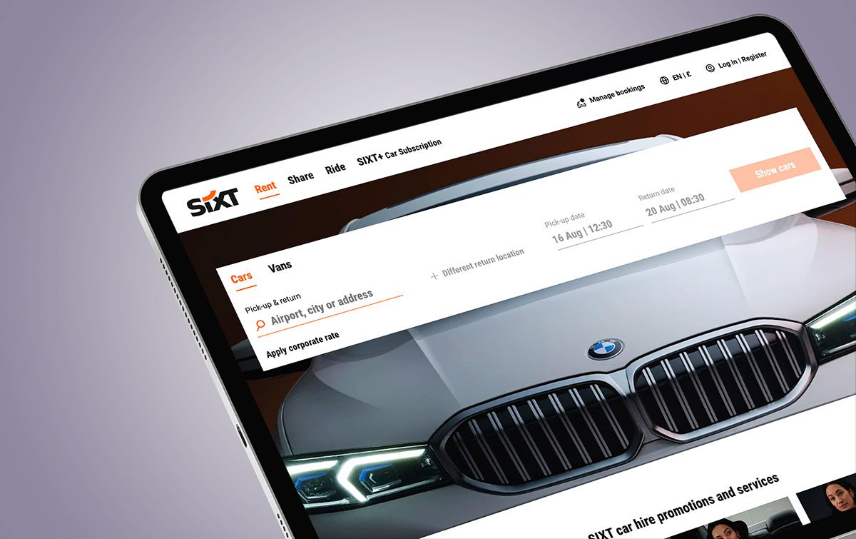
Sixt is a global car hire company offering a wide range of vehicles for rent, including luxury cars, vans, and SUVs. Known for premium service, it operates in over 100 countries worldwide.
Challenges

The REO approach
To find out more the CRO team ran a poll using Hotjar on the car listings page to ask users: “Are you planning on making a booking today?” with three possible answers:
- Yes, I’m ready to book
- Maybe, if I find the right offer
- No, I’m just researching options
The results showed that only 20% of respondents were “ready to book”. The vast majority were not yet committed with 57% saying “maybe” and 23% saying “no”. This indicated that 80% of users on the car listings page were in the research phase of their booking journey and therefore less likely to complete their booking.
The CRO team subsequently devised an experimentation strategy to encourage the 80% of users in the research phase to complete a booking. This was a stepped approach:
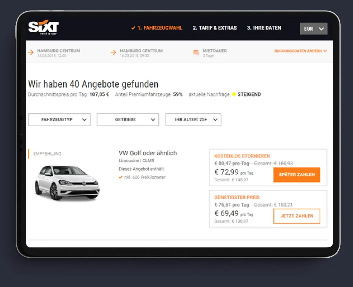
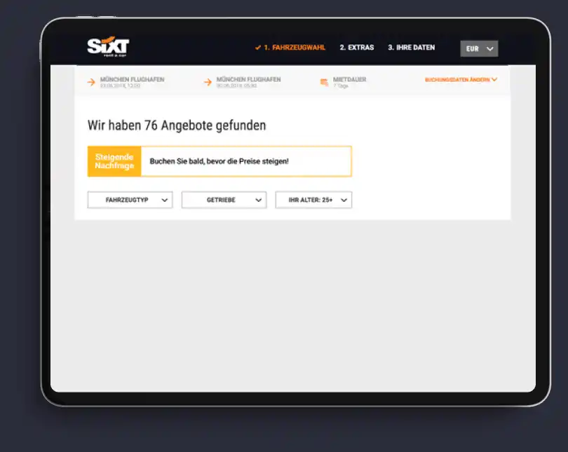
However, the listings page did not display any message to inform customers that this was the case. Sixt wanted to be more transparent with their users about demand at their pick-up stations and pricing. Previously, the in-house team had tested an indicator showing the current availability at the user’s requested pick up location. The level of demand was represented by a traffic light status of red, amber or green accompanied by copy to indicate if demand was high, medium or low.
However, the addition of this information plus other indicators of availability did not significantly impact bookings when it was AB tested against the control using Optimizely.
Deliverables
The team knew from previous testing that adding a sense of urgency is very effective at increasing conversion. In a recent test for a retailer the CRO team had tried two variations of urgency messaging copy around items that were low in stock.
One message simply informed users that this was a “Fast Selling Item” and the other added a prompt to act with “Hurry, selling fast”. Both increased conversion but the simple “Fast Selling Item” copy performed best.
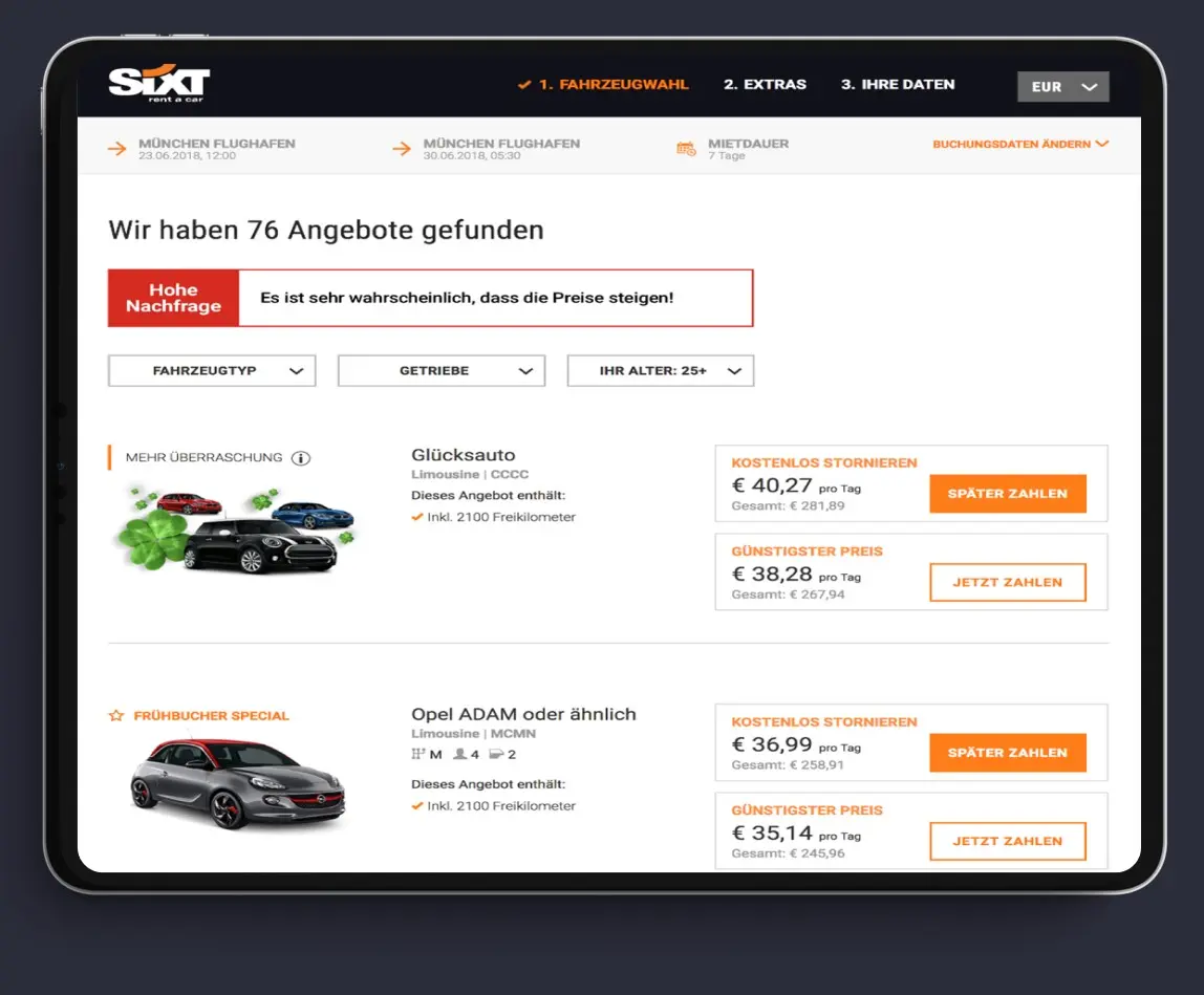
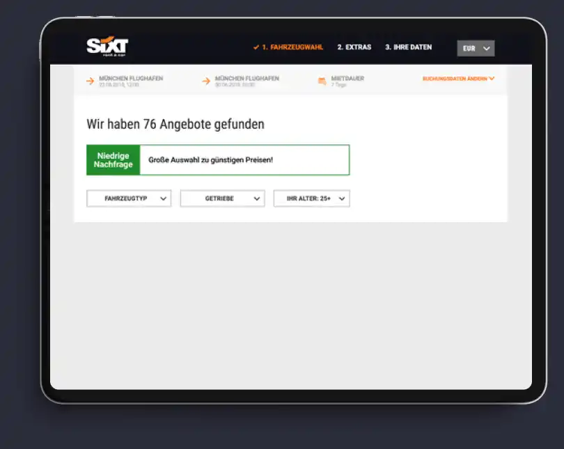
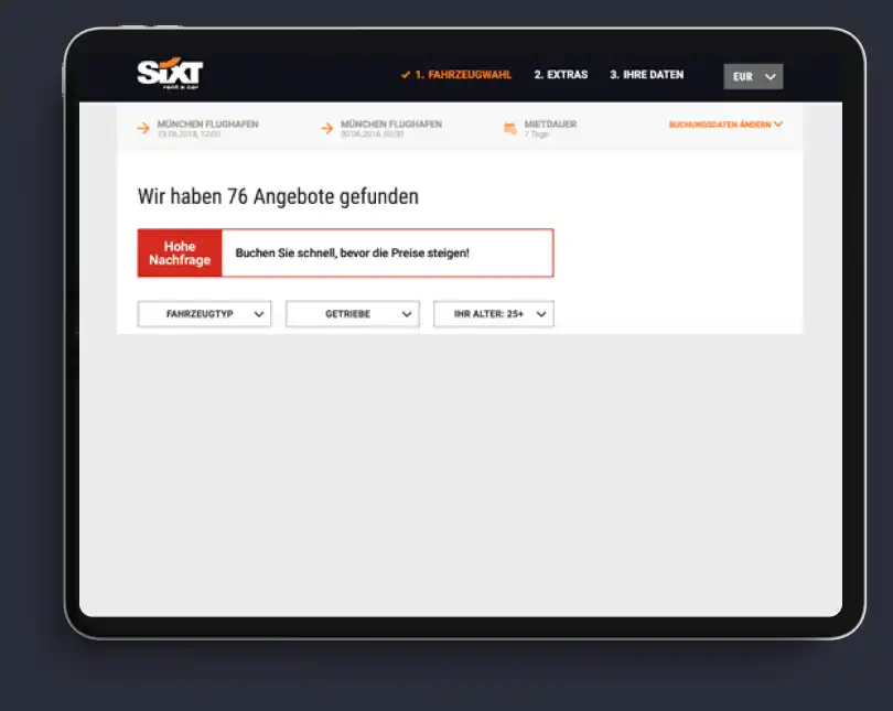
Users seemed to respond better to the informative message rather than the message instructing them to act. Armed with this knowledge and to persuade more of the “Maybes” and “Nos” to take action and complete their car booking with Sixt we devised a test to display a message solely focussed on the station demand status (availability) accompanied by copy explaining the implications of the status in terms of potential future price rises.
We created different sets of copy for the three different station demand statuses on the German site.
Once again, we saw that the informative copy outperformed the more instructional copy. It appears that users are more likely to respond to urgency messaging if you simply inform them of the situation. Adding an instruction to act is not as effective. In other words, users are smart enough to draw their own conclusions about how to proceed and perhaps slightly resistant to being
told what to do!
The outcome
The data has consistently shown that providing clear information yields better results than directive content. It seems that when users are made aware of the circumstances, they are more inclined to take prompt action without explicit instructions. This suggests that users prefer to make their own decisions on how to move forward and might be somewhat averse to overt directives.
The impact of this communication strategy is substantial, leading to an impressive gain of 31,000 extra bookings and generating an additional revenue of €5.5 million. This success was made possible through a range of services, such as conducting research surveys, applying experimental techniques, developing messages that create a sense of urgency, offering design and user experience guidance, solving complex problems, and formulating strategic
research approaches



“Existing analytics data indicated a trend in online behaviour for users visiting the site and making a rental search multiple times prior to booking.
“To understand this behaviour in more detail, we introduced additional data points such as an on-site survey, which provided invaluable insight into different segments of customers and their reasons for dropping out at various stages of the funnel.”